Product Details
Giclee printed on paper stock: Awagami Washi Bamboo 170 gsm
(The finest quality, archival, acid-free paper. 100% ecological, crafted from natural fibres + pure mountain water, it’s handmade for beautiful print output and longevity.)
Printed in England
Authentication label on reverse
UNFRAMED PRINT SIZE: A1 / 594 x 841mm / 59.4 x 84.1cm / 23.4 x 33.1 inches
FRAMED SIZE (WITHOUT MOUNTS): 622 x 869mm / 62.2 x 86.9cm / 24.5 x 34.2 inches
FRAMED SIZE (WITH MOUNTS): 692 x 939mm / 69.2 x 93.9cm / 27.2 x 37 inches
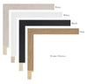
Frame options: Oak with or without mount, White with or without mount, Black with or without mount, Putty with or without mount
Please note: Our framers are recognised by the Fine Art Trade Guild for their quality because the custom frames have tightly pinned corners, and are made from precision cut wood in England, made bespoke for each order. All our frames are glazed with our Clarity+ Perspex. It's cut from the highest quality acrylic sheet that's both crystal clear, but also safe and filters out 99% of UV light to protect the artwork.
THE STORY

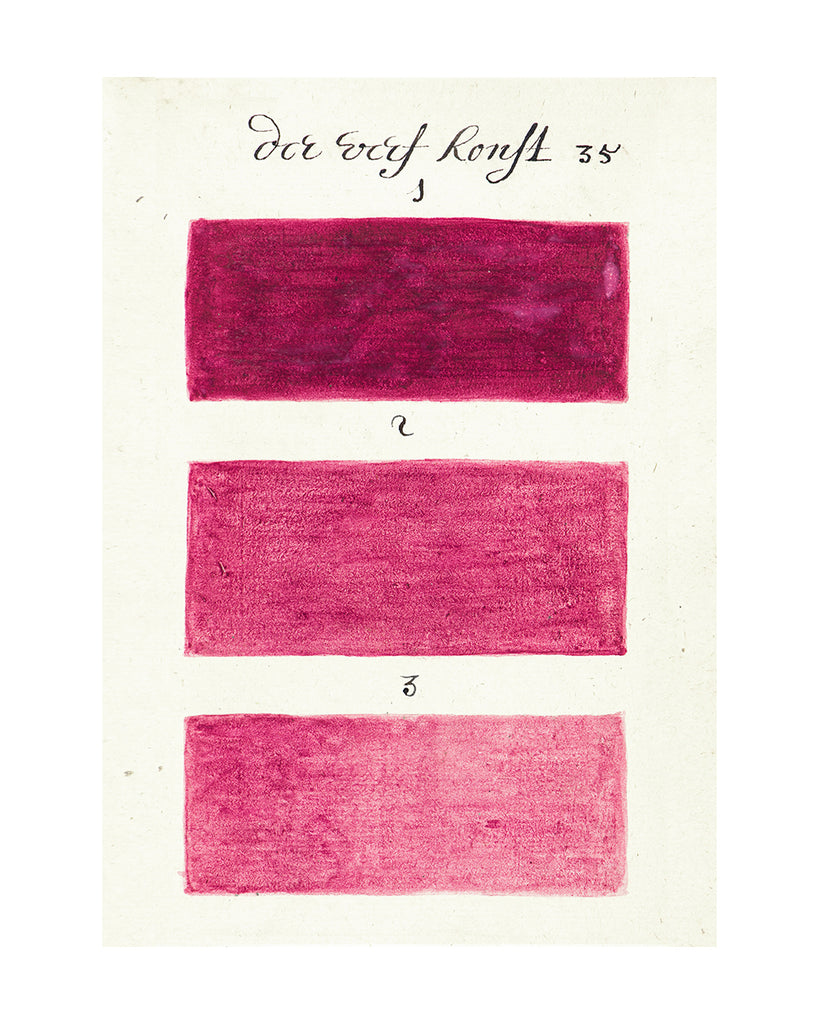
“There is nothing in the world so rare that a colour cannot here be found to resemble it”

As many of you will know The Shop Floor Project was granted permission to create a print collection from the pages of a remarkable 17th century manuscript titled “A Clear, Shining Mirror of the Art of Painting” which is hidden deep within the archive of a French library.

No one quite knows where the book had been, or who the various owners were, between 1692 and 1916 when it was donated to the Méjanes library in the south of France, and its journey is still not over.

On the eve of the book being taken out of its quiet archives and placed (quite literally) under the microscope of various academics - from universities in France, Holland and the Rijksmuseum, where specialists in art history and linguistics will work on the translation from old Dutch to English, and scientists carry out physicochemical analysis of the pigments - we were given a access to the manuscript once more to select twenty eight images.

Working with archive photographer Georges Flayols and our new Fine Art Trade Guild accredited printers we can now bring even richer colours and tones to the prints - one of our best-selling collections has just become even more beautiful!

Created in 1692, during the heady days of the Dutch Golden Age, when Vermeer painted interiors and Maria van Oosterwijck painted extraordinary flowers, a Dutch man was busy creating what is possibly the very first colour chart in existence - almost 300 years before the Pantone Colour Guide was launched.
This magical book contains over eight-hundred pages and two-thousand hand painted, watercolour ‘swatches’. Although created in 1692, there is an undeniable Modernist appearance to these pages, recalling the work of Rothko, and even Turner's epic seascapes come to mind when you look at the storm-like clouds of ‘No9'.
We whittled down the eight hundred pages into a collection of both tonal shades and bold contrasts, allowing for a multitude of combinations.

If you’d like to read more about the book, The World of Interiors wrote a beautiful eight-page feature interview with us - you can read it in our Press page here.
The book is located at Aix-en-Provence, Bibliothèque Méjanes, Ms. 1389 (1228)