Arrow Fat Left Icon Arrow Fat Right Icon Arrow Right Icon Cart Icon Close Circle Icon Expand Arrows Icon Facebook Icon Instagram Icon Twitter Icon Hamburger Icon Information Icon Down Arrow Icon Mail Icon Mini Cart Icon Person Icon Ruler Icon Search Icon Shirt Icon Triangle Icon Bag Icon Play Video

STORIES

A Tiled Tapestry | Charlotte Salt

A Tiled Tapestry | Charlotte Salt

Charlotte Salt is a ceramic artist based in North Yorkshire where she works from both her home workshop and the AHH studio collective. A childhood spent exploring her parents' pottery studio means she has been playing and working with clay all her life.

Charlotte works intuitively, using traditional coiling, slab-building, modelling and pinching techniques to create unique works. Everything from the brush strokes on the surface to the physical imprints that intentionally remain, serve as a testament to the making process.

Earlier in the year, The Shop Floor Project commissioned Charlotte to create a collection of tiles inspired by the magnificent Devonshire Hunting Tapestries at the V&A Museum. The tapestries are four very large and beautifully designed tapestries made between 1430 – 1450, depicting hunting scenes of boars, bears, swans, otters, deer and falconry. Very few tapestries of this scale and quality of design have survived and the gallery dedicated to them at the V&A is spectacular.

Charlotte initially visited the tapestries in person at the Museum, filling sketchbooks with possible tile designs. Back in the studio Charlotte spread many reference books across her table, happily getting lost within the details of each tapestry and translating them into designs.

For this first set of tiles, Charlotte has mainly focused on the multitude of animals that animate the tapestries; hunting dogs, bears, deer, otters, swans and owls all feature. 

Other highlights include those of castles and portraits with those magnificent headdresses. 

Each tile is hand-made, rolled, cut and, after the first bisque fire, Charlotte draws a pencil outline onto the tiles and then paints bold strokes in oxide glazes.  

Like an alchemist, Charlotte uses her signature mixture of red and buff stoneware, with cobalt oxide and iron chromate, to achieve a collection which has an ancient appearance. They feel as though they have emerged from the same time as the Tapestries that inspired them.

The Hunting Tapestries, which feature an abundant depiction of hounds, is a gift to Charlotte, who is also drawn to these elegant creatures in her own work. This subject can be seen throughout the collection, with dogs leaping across a tile and into another.

As a single piece, each tile is a painting in miniature, a beautiful study of a fragment of the Tapestry. When placed together in groups they start to build a scene or narrative and it’s fun to place different ones next to each other, to watch a composition emerge.  


Continue reading

The Breakfast Table | Rebecca Brown

The Breakfast Table | Rebecca Brown

There is a very special house, in the historic area of Spitalfields in East London, that has inspired our latest collection.

Dennis Severs’ House is a gem of early 18th century London architecture. Built in 1724 and saved from dereliction by the Spitalfields Trust, Dennis Severs reconfigured it in the 1970’s  to tell the story of an imaginary Huguenot family who had lived there since it was built in 1724.

The remarkable thing about the house is that it is set out as if the family has just left for the day, with surprising and humourous details at every turn. 

(Dennis Severs’ Kitchen: Photography by Lucinda Douglas-Menzies)

It was on a recent visit to the house, and seeing the kitchen table (above), set for breakfast by candlelight, that led us to commission the ceramicists Fliff Carr and Rebecca Brown to create a special collection for a late winter, early spring breakfast table. 

Rebecca Brown initially studied Textile and Surface Design at Gray’s School of Art in 2010, before going on to study for a Masters in Illustration at Edinburgh College of Art in 2014. After graduating Rebecca moved from Inverness to Sheffield to join the Ceramic Starter Studio at Yorkshire Artspace.

Working in porcelain and stoneware, Rebecca combines drawing, painting and printmaking to build narrative on the surface of decorative hand built ceramics. Fingerprints, brush strokes and making marks are intentionally left exposed to accentuate the relationship between vessel and subject.

Rebecca's wonderfully playful animal pots have their roots in early 18th century European pottery. The Ginger Cat above has such a presence, it could almost be alive, and the Blue Cat Pot (below) sits like an ancient, giant, cat-shaped pebble.

The plump pigeon pots, characterful cats and resting rabbits are inspired by pieces from the Chelsea Porcelain Factory which were produced around the early to mid 1700's and designed 'to animate the table and celebrate the possibilities of clay'.

Rabbit Tureen, Chelsea Porcelain factory, Chelsea, ca. 1755. Victoria & Albert Museum: 414:328/1, 2-1885


These works were the largest pieces ever made to date in porcelain at the Chelsea factory and in the original 1755 sales catalogue for the piece above it was described as: 'a beautiful tureen in the form of a rabbit as large as life, and a fine dish to ditto’,

Chicken Tureen, Chelsea Porcelain factory, Chelsea, ca. 1755. Victoria & Albert Museum: C.75 to B-1946


Rebecca continues this tradition, sculpting in stoneware with various glazes. The colouring on the pigeons is so beautiful, with all the colours seen in a feather, beautifully recreated in oxides.

Hand-building the Pigeon Pots

Glazes drying after the bisque-firing stage.

A perfect pot for holding eggs...

Rebecca's brilliant Butter Birds are the perfect design. When closed they look like a bird nesting, but when the lid is lifted, the wide base transforms into a flying bird. Just a wonderful design.

These blue and white 'Butter Birds' also follow in the 18th century craze for animals in butter dish form; this example (below) is a tin-glazed earthenware Tortoise Butter Dish from 1755.

Butter Dish in the form of tortoise, German Ca. 1755, Germany, Victoria & Albert Museum C.78&A-1950 

Here are a pair of Butter Birds about to take a nibble out of pastry on one of Fliff Carr's beautiful plates.

Continue reading

An Artist's Garden | Georgie Richardson

An Artist's Garden | Georgie Richardson

As the seed catalogues hit our doormats and we cosy up by the fire, dreaming of spring, let Georgie Richardson’s collection of Flower Portraits stir the imagination and remind us of the seasons to come. Of names momentarily forgotten in the depths of winter; hellebore, hyacinth, poppy, primula, foxglove and chard.

A graduate of Fine Art Painting at Winchester School Of Art, Georgie Richardson doesn't have to go far to find inspiration. In her garden that surrounds her home and studio in the foothills of the Black Mountains in Herefordshire, the artist nurtures a careful balance between wildness and cultivation. 

Celebrating the self-seeders that make a home in her garden, means that all manner of surprising compositions occur; a foxglove may settle beside the calendula, and a knapweed pops up under a rose. It is these relationships that Georgie explores within her work.

There is a theatricality to this collection. As though each one is a stage set, with their Bloomsbury-style swags, borders and dark backdrops. 

At this special time of year, when we are full of anticipation for all the seasons to come, Georgie has captured this delight. The energy bursting forth from the bare earth into these fireworks of floral displays is palpable. From small scale primroses to huge hellebores, these works have real impact.

We couldn't think of a more wonderful and uplifting collection to start the year. Outside, as the tips of bulbs are pushing through the bare earth and names, momentarily forgotten in the depths of winter, are recalled again. 

Georgie's use of bold, graphic marks combined with her observational skills means that she is able to get directly to the essence of a form. A difficult accomplishment for any artist, this fluidity and ease belies the amount of work and time it takes to master this. Such beautifully observed and simplified forms are the stuff of a skilled artist at work.

Any gardener, or observer of flowers, will recognise and delight in the familiar structures and habits of specific plants seen throughout Georgie's work; the tendril of a sweet pea with its furry pods; trumpet-like flowers of the nicotiana, the tobacco flower (above); primula rising from their wide bases and nasturtiums captured from every angle (below).

All of these are painted with a playful yet sophisticated use of watercolour and ink. Flashes of brights amongst the muddy greens and pale pinks - it immerses the viewer right in the centre, in the sheer excitement of blooms.

The artist refers to her work as Flower Portraits and, through them and documenting the changing seasons, she hopes to ‘provide an anchor and comfort from which to navigate this transient life’.

We then commissioned Georgie to create a series of painterly moths to pollinate her Artist's Garden collection. Illuminating the garden at dusk, like delicate silk, each one is captured in Georgie's signature energetic and colourful hand.

Flying into An Artist's Garden, species to spot include the elephant hawk moth (above), the yellow underwing and the ermine moth.


Make like a lepidopterist and display a collection together.

Above, the Puss Moth, so named as their fluffy appearance brought comparison with a pussycat.

Above: Large Yellow Underwing, framed in black wooden frame. 

The delicate beauty of the tissue-paper like layers of the Green Oak Roller Moth

There is a theatricality to this collection. As though each one is a stage set, with their Bloomsbury-style swags, borders and dark backdrops.

Like a player in a play, each specimen is waiting to have its turn in the spotlight -  as the seasons change and the sun moves around to shine on that specific plant, or signify to a moth that it’s time to metamorphose from its cocoon, spreading its glorious wings in these silk-like gouache and ink paintings.


Continue reading

The Hand Puppet Kits | Story

The Hand Puppet Kits | Story

The Shop Floor Project hand puppet kits, designed by Samantha Allan, have two distinct inspirations, as she explains:

“I have had a copy of the book Paul Klee, Hand Puppets on my studio table for five years. Between 1916 and 1925 Klee made over 50 hand puppets for his son, Felix, of which 30 are still in existence. For the heads, he used materials from his own household: beef bones and electrical outlets, bristle brushes, leftover bits of fur and nutshells. Soon he began to sew costumes, using his wife’s collection of old clothes. They have such a presence and really speak of that time in the early 20th century, when toys were made by artists in their homes, busy with visitors from all corners of the the avant garde.”

“I combined these hand puppet designs with a love of folk customs and characters (below). My hope is that people will sew the kits and add their own embellishments; scraps of fabrics, embroidery or old buttons. I imagine winter evenings with folklore stories being told around a fire, brought to life with these puppets.”

The first set of designs included Wolf Woman, Star Monster, Ribbon Man, Twig Man and Breton Clown (seen below). A second collection of the popular kits emerged; this time including designs such as The Conjuror, Sleepy Moon and King Rooster.

Final additions to the characterful collection included three new designs: A bee keeper with a netted face, cloaked in red and covered in bees embroidered in gold thread; a figure covered in rags and tatters with a mask made of confetti; and a fur-trimmed ghost of the snow forests, wearing a coat which contains the landscape she travels through.

Following on from the interest people have shown in adding their own embellishments to the hand puppet kits, we designed these new additions as a ‘modern sampler’, using a series of patterned embroidery stitches within the designs to suggest where embellishments could be made.

The Bee Keeper is particularly inspired by a Basque country folk costume, with it’s strange lace mask and robe, which the artist developed into a bee keeper with a gold bee adorned cape.

The Snow Traveller is inspired by stories from The Book of Russian Folk Tales. The fur trim can be added using a Knot Stitch (which you can learn from our book The Geometry of Sewing), while French knots in white wool could act as falling snow and a feather stitch for the central panel.

Mr Rags, is inspired by a certain sub group of Morris or Rag Dancers, who cover their clothes in scraps of fabric, wear masks and add feathers to hats. Designer of the kits Samantha Allan explains how she embellished her own Mr Rags - “I’ve covered the mask in a ‘seed’ stitch, put gold sequins in the eyes, and coloured straw in his head. I’ll be adding lots of little rags to his costume soon so he is heavy with them!”.


Continue reading

Birds of a Feather | Denise Allan

Birds of a Feather | Denise Allan

Birds of a Feather is a collection of limited edition fine art prints taken from a series of original painted panels by Denise Allan. The collection is inspired by the artist's recent discovery of an early 17th century Il Bestiario Barocco (or The Feather Book), created by Dionisio Minaggio whilst he was the Chief Gardener of the state of Milan between 1616 and 1618.

Each page of the hand-made book depicts one or two bird species of Northern Europe in great detail. On first viewing they appear painted, however with closer inspection it's clear they are constructed from an intricate web of real feathers augmented with pieces of bird skin, feet, and beaks.

Denise comments that "The skilful use of these found materials produced a book with a charming naivety, found in the best examples of folk art."

The Feather Book, along with early examples of painted furniture inspired Denise Allan's original painted panels on board, from which the prints are expertly recreated from.

The prints bear all the marks of the originals: the chalky faded paints and the grain of the wood.

Continue reading

The Plant Hunter | Denise Allan

The Plant Hunter | Denise Allan

The Plant Hunter is a collection of beautiful fine art reproductions which are museum quality and expertly printed faithfully to the original paintings by Denise Allan. 

Featuring flowers, weeds and vegetables, initial inspiration came from an edition of De Materia Medica, a multi-volume book on herbal medicine illustrated by the Italian artist and botanist Gherardo Cibo (1512–1600) whose herbal illustrations are set against Italian landscapes (below).

Further inspiration came from the botanical works of Marianne North and her astonishing rooms at Kew, dedicated entirely to North’s work. The framing of Denise’s paintings has also been inspired by these rooms, where the frames are placed close to each other so they almost become a room of panels, creating a kind of church to botany.

(More than 800 remarkable paintings cover the walls of the Marianne North Gallery at Kew)

The plant subjects for Denise Allan’s new collection can be found amongst the wild flora of the Levens Estuary and on the shores of Morecambe Bay. It is part of an ongoing exploration of the flora and fauna found within the landscape surrounding the artist’s home and studio.

On daily walks she collects sketches of sea holly, wild plantain, briar rose and sea pinks, along with specimens that have found their way out of the gardens that edge the shore, such as Chinese foxglove, snowdrops, a lone tulip and a self-seeded kale.

Back in the studio, these sketches of humble flowers are elevated to monumental sculptures set against stormy landscapes with their roots planted into earth. The scale of the specimens places the viewer at an insect’s-eye-view, looking up in awe at these structures.

The works contain astonishing detail; look closely at the bulb of the narcissus or its peeling dried paper-like spathe - it almost crunches.

Any of us who garden, or look closely at plants, will share the artist’s appreciation in the beauty of something as simple as a bolted kale. In Bolted Kale (below) there is a quiet grandeur, a regal column of beautifully painted curled leaves, crowned with a spray of yellow brassica flowers and black seed pods.

Whilst many of the landscapes brood with the promise of an oncoming storm, others such as Sea Holly (below) contain a fresh luminosity. As always, Denise manages to create a tangible atmosphere within her work, as shown in Sea Holly where it feels as though the sun has just appeared after the rain, with a warm mist rising.

Given that the weight and presence of these specimens are as tactile as a three-dimensional object, it is no surprise that Denise Allan studied sculpture as well as painting for her BA Hons. in Fine Art.

Often working with installations within the landscape, her early work was a form of Land Art, but increasingly, over the years, she enjoys bringing her work back into the studio. This interplay between interior and exterior, bringing the outside inside, means that the sense of being situated in the landscape always remains, and is a fascinating development from her early works.


Continue reading

The Tinsmiths | The Story

The Tinsmiths | The Story

It's a real treat early each year to develop our hand-made tin decorations. It begins with field trips, in the depth of winter, to old churches around the country to gather sketchbooks full of ideas. We then work with traditional artisans in Mexico who turn our drawings into these spectacular tin decorations, interpreting our sketches and designs with a real sensitivity.

There is a fascinating similarity between early English church carvings and wall paintings with the Mexican folk art aesthetic, and it's one we absolutely love to explore and develop each year with these decorations.

The wall painting in Hardham church, Sussex (possibly the earliest existing example in England) inspired the introduction of a pale turquoise blue within the collection, as seen on the haloes in the painting above. We worked closely with the artisans to create the perfect blue and have applied it to the angel’s dress, the eyes of the Frog Prince and in ‘gemstones’ in the crowns of the swans.

The whole collection is a rich tapestry, with a wealth of inspiration behind each motif and character.

This pair of Trumpet Angels were inspired by the beautiful ‘angel roofs’ seen in early English churches. First built in the 14th century, these roofs are decorated with intricately carved wooden angels flying above in the oak rafters.

Only 170 survive today and because so little of the art from England’s medieval churches survived the Reformation, that makes these cherubim the largest surviving body of major English medieval wood sculpture. We couldn’t resist celebrating them in these decorations.

Our tin decorations are hand crafted by a traditional workshop in Mexico. Tin work, known in Mexico as hojalata, goes back to the 16th century and is known as ‘poor man’s silver’.

Intricately embossed, the decorations catch the light as they turn in the drafts and breezes in the house. Because tin is a very durable and lightweight material, it’s possible to fill an entire tree with these and not cause the branches to sag! Equally, a single piece looks beautiful in a window.

The Sun Face (above) was inspired by the wall painting at St Mary's Church in Berkeley, Gloucestershire (below).

Finding inspiration for the newest designs lead us to explore the eccentric Shell Houses and Grottos secretly hidden throughout the English countryside, to create some extra special decorations.

The Siren (above), with modelled scaled tail, fish-bone body, encrusted shell crown and a pair of bejewelled fish.

The ‘shell house’ was a trend started in the 1600's by aristocrats who wanted to create follies and structures inspired by ancient Greek and Rome. Often lit by candlelight, these 'hidden' structures often where elaborately decorated with every type of shell conceivable.

We wanted to echo this candlelit atmosphere so created our life-size scallop and mussel shells, lined with gold or iridescent blue. They come to life as the light falls on them.  

The shells can be gently opened or closed. It's a lovely idea to open them on a table and perhaps, in the 18th century style, handwrite your guest's name, a witty joke or a proverb and fold it up inside each shell...

The oldest Shell Room in Britain was built in 1620 by Isaac De Caus. Other magnificent rooms, houses and grottos include the Grade I listed Grotto HIll in Margate and Goodwood Shell House (above) which was most likely designed by Roger Morris (1675-1749). Photograph: Antony Crolla

Make your very own Shell House inspired scenes and watch them catch the low winter light.

More sea-themed tin decorations include the Sailing Ship, Swans, Shooting Stars and Angels to watch over.

The golden Sailing Ship sails on top of blue stormy waves.

The pink angel with gold halo watches over the night sky.

The silver swans glides silently over the midnight blue sea.

In other designs, we go into the forest with the new and mighty gold-faced stag, with his wonderful 'fur' and golden antlers. Deep in the pine forest he finds regal cats, golden geese, hedgehogs and owls. 

The Crowned Cat with an extraordinarily grand coronet studded with painted turquoise.

A wise owl in the tree tops.

Fruits for Kings & Queens. The new Pineapple design is added to the regal pear.


Continue reading

Beaded Beasts | Story

Beaded Beasts | Story

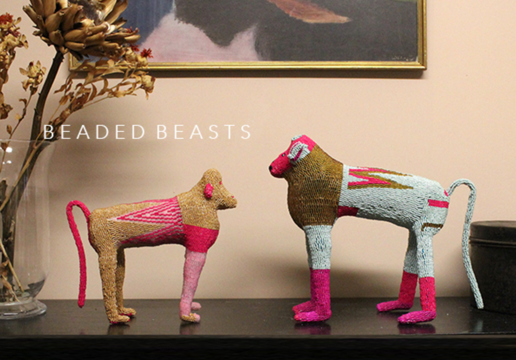
Each year we spend time working with South African design collective Monkeybiz; commissioning, collecting and gathering to create some completely amazing pieces for our collection of Beaded Beasts.

Reviving the ancient craft of beading, the co-operative of women from South Africa form part of an extraordinary contemporary project which celebrates the art form. These striking handmade sculptures have been the subject of a sell-out exhibition at Sotheby’s and are held in the Smithsonian Design Museum - they are quickly gaining cult status.

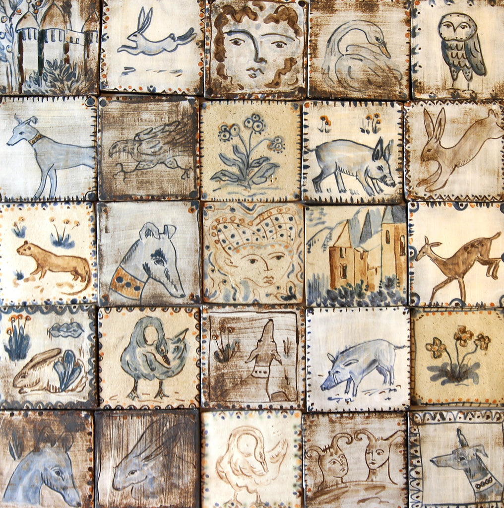
Animals in our collections have included huge Modernist owls with rug-like patterns and expressive eyes, tall-eared rabbits, cockerels, sleepy rhinos, proud baboons and little piglets.

The creatures have a Modernist feel to them with their exaggerated forms, simple yet expressive faces and asymmetric patterns. They look striking displayed with other treasures and artwork, creating an eclectic cabinet of curiosities aesthetic.

The Beaded Beasts are made with wire armatures (above) which are then stuffed and then covered in a hand-beaded 'skin' in a riot of colour and pattern. The final result is a substantial sculpture which stands with presence and character.

The Patchwork Rhino (above)

The Green Faced Owl (above)

(Shangaan artist. N'wana c. 1950 University of Iowa Museum of Art - Symbols of Self: Art and Identity in Southern Africa)

Traditionally beads through the ages were used not only to adorn the body, but as a measure of value in ritual and economic exchange between locals and foreigners. In traditional African rituals, a fine bead necklace or beaded piece is treasured because it is thought to impart spiritual energy.

Colours are invested with meaning. For example, pink can denote poverty and the use of pink beads could mean: "you are wasting your money and have no cows" or poverty of feeling "You do not love me!". Messages are encoded on a huge range of artefacts including bags, belts, collars, headdresses, vessels.

When lockdown first hit in March 2020, the not-for-profit arts organisation found all of their orders from galleries around the world were cancelled and their iconic shop in the Bo-Kaap district was closed. They contacted us to see if would be interested in placing a large order, and after many pixilated Skype calls and virtual tours of the collections (with a force 10 winter storm raging outside their HQ and several power cuts later) we selected some of the most extraordinary pieces.

The new collection, and how we managed to curate it with MonkeyBiz during a pandemic, was then the subject of an article in The World of Interiors called Animal Assembly (March 2021)

Monkeybiz enthusiasts include Archbishop Desmond Tutu, designer Donna Karan and Nelson Mandela (who all appear on a documentary about their work called 'Bigger than Barbie' by Norwegian director, Tina Davis). 

The Monkeybiz project reminds us of the Gee’s Bend quilters in the southern states of America whose work the New York Times said “are some of the most miraculous pieces of modern art America has produced.”

The same could be said of the MonkeyBiz collective, acknowledging their place in the history of South African modern art. The women create extraordinary works in their domestic spaces, often communally and imagine or recall patterns and colours from their surrounding environment and culture, abstracting them into ‘beaded hides’ with elaborate manes and exaggerated forms.

The collection featured almost one hundred pieces - the largest collection of Monkeybiz we have ever had. The collection included sculptural baboons which can stand at 45cm tall and often have a square of pink under the tail for the all important ‘pink bottom’! Other pieces include hares and rabbits with exaggerated forms of large bodies, small legs and huge ears. Often the face appears like a mask (the designs on the one above particularly looks like an antique rug). Lions with shaggy beaded manes, owls, elephants, giraffes, cockerels and more!

The pieces are extraordinary and range from large scale lions, elephants and warthogs to smaller indigenous animals like the dassie. We often describe them as looking as though they have been upholstered in fragments of woven rugs.

We also very lucky to have been able to acquire pieces by one of the most celebrated and collected artists in the co-operative, Zisiwe Lumkwana.  A skilled maker whose work is often used for exhibitions around the world, Zisiwe's work is highly sought after. Trained as a healer she learnt beadwork from other traditional healers as they would create beaded adornments to wear in practice and training.

Making the sculptural wire armatures herself, characteristics of her work often feature of an exciting mix of fine beadwork, sophisticated colour combinations, exaggerated forms and in particular red beaded mouths, teeth made from loops of beads and careful attention to the eyes and the expression of the animal. Zisiwe's work can been seen in collections around the world.

As well as spending each year securing the best of the best pieces fresh from the artists' workshops, we have also been commissioning new works and shapes. Developing larger and more unusual pieces that we're very excited about.

The beaded patterns and colours all speak of the rich cultural language of shapes and symbols within African art. Geometric shapes such as diamonds, lozenges, triangular or square chequerboard, parallel zigzags, chevrons, dots, circles, curved lines and waves are all heavily represented, as are symbolic motifs which refer to the natural world such as crescents, stars, mosaics, flowers, fruit, seeds, pods and trees.

Image top left from AFRICAN TWILIGHT: Vanishing Rituals & Ceremonies of the African Continent

The extraordinary red beaded mane of the Modernist Lion (above) instantly brought to mind the red fringed folk costumes used in ceremonies and the fringed masks of Bobo people of Burkina Faso.


Continue reading

17th Century Paintbox | Story

17th Century Paintbox | Story

“There is nothing in the world so rare that a colour cannot here be found to resemble it”

As many of you will know The Shop Floor Project was granted permission to create a print collection from the pages of a remarkable 17th century manuscript titled “A Clear, Shining Mirror of the Art of Painting” which is hidden deep within the archive of a French library.

No one quite knows where the book had been, or who the various owners were, between 1692 and 1916 when it was donated to the Méjanes library in the south of France, and its journey is still not over.

On the eve of the book being taken out of its quiet archives and placed (quite literally) under the microscope of various academics - from universities in France, Holland and the Rijksmuseum, where specialists in art history and linguistics will work on the translation from old Dutch to English, and scientists carry out physicochemical analysis of the pigments - we were given a access to the manuscript once more to select twenty eight images.

Working with archive photographer Georges Flayols and our new Fine Art Trade Guild accredited printers we can now bring even richer colours and tones to the prints - one of our best-selling collections has just become even more beautiful!

Created in 1692, during the heady days of the Dutch Golden Age, when Vermeer painted interiors and Maria van Oosterwijck painted extraordinary flowers, a Dutch man was busy creating what is possibly the very first colour chart in existence -  almost 300 years before the Pantone Colour Guide was launched. 

This magical book contains over eight-hundred pages and two-thousand hand painted, watercolour ‘swatches’. Although created in 1692, there is an undeniable Modernist appearance to these pages, recalling the work of Rothko, and even Turner's epic seascapes come to mind when you look at the storm-like clouds of ‘No9'.

We whittled down the eight hundred pages into a collection of both tonal shades and bold contrasts, allowing for a multitude of combinations. 


Continue reading

Francesca Kaye | Story

Francesca Kaye | Story

London-based ceramist Francesca Kaye uses stoneware in an almost sculptural way, creating hand made moulds in various shapes and sizes which she presses the clay into.

Francesca's unique, handmade plates and platters, vary from the very large to smaller pieces, achieve an irresistible tactile quality, almost ancient in feel. Indentations and an unevenness give the work a lively energy that can only come from the hand of the maker.

Francesca began her career in weaving and textiles, but promptly changed discipline after studying ceramics at Goldsmith’s College in the 1990’s. In recent years Francesca has worked from her purpose-built studio in the bottom of her garden.

Prolific and intuitive, she creates work in her bold yet delicate style, which is completely unique, referencing an array of influences. Asked for just a few of them, Francesca lists “the ceramic department of the Victoria & Albert Museum, Hungarian folk art, children’s stickers and Matisse!”

Her latest collection is inspired by French 18th century block printed indigo textiles, and is an explosion of pattern and illustration.

Restricting her palette to that of blue and white, Francesca has created a series of pieces that are at once both energetic and contemplative. 

The scalloped edges and deep decorative borders are either filled with silhouettes of flora or portraits of women in traditional folk costume. 

The floral pieces are reminiscent of the cyanotype, a pre-photographic technique that involves laying an object on coated paper before exposing it to sunlight to create white and Prussian blue images.

In much the same way, Francesca blocks out shapes, not from the sun, but from the indigo blue glaze she brushes onto the surface, creating these white silhouettes. She does this by using the wax resist method. An ancient technique often applied to textiles, Francesca uses it for ceramics and regularly employs it throughout her work to achieve these energetic shapes and patterns that are impossible to resist.

The portraits, nestled within kaleidoscopic borders of patterned lace, are very personal to Francesca. They are drawn from books and imagery collected over a lifetime, from early childhood when her father would seek out dolls in traditional dress from whichever country he was visiting for work, to bring home to a young Francesca. 

These portraits are so evocative. In these patterned borders they bring to mind early photography of people in their finest dress, with the photographs displayed in patterned and painted frames. 


Continue reading
  • Page 1 of 2
  • Page 1 of 2